 |
| Western side of Pitt Street between Market and Park Streets |
Looking for information on the clothier, I discovered that other Sydney bloggers have featured this faded advertisement. Sally featured it in January 2008 and Nathalie featured it in June 2007.
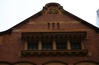
249-251 Pitt Street Sydney is Simpson House which ia an 8 storey building constructed in 1912 and renovated in 1983. It is listed in the Australian Heritage Database. Originally named Film House, the tenants included Australasian Film Limited, Spencer's Film Exchange, Kinetophone West's Film Exchange and Cinematograph Supplies, International Film exchange, Patahe Frere's Film exchange, Paul J Rainey (American film depot), and Sydney Riley (photographer).
Rex Simpson's Menswear occupied the building post WW2 whereupon the name was changed. Murals were painted upon both the northern and southern walls. Today a shoe shop occupies street level.
 |  |
 |  |
The Heritage data-base states:
In Federation Warehouse style with possible Anglo Dutch influences, it was built of English bond face brick with sandstone detailing (piers, lintels, arches, cornice and mouldings). A pair of tall oriel windows extend from the 2nd floor level above large arched 1st floor windows and are topped by a ventilated cornice in an unusual position above the 4th floor level. The single large pediment, inscribed AD 1912, is flanked by gutters. Main fenestration consists of tall rectangular openings detailed in sandstone and arched on the 6th floor. On the top floor a central opening in the pediment is classically detailed.
In the small foyer, were framed B&W photographs from the early years of the 20th century. This one shows, on the right, 249 Pitt Street immediately prior to the construction of Simpson House (aka Film House).
 |
16 comments:
Beautiful and lovely shots !! This is Great !!
The rain catch/gutter is very unique. And quite the contrast between eras with a more modern Hilton behind the 1912 building. Nice!
elle est belle cette vieille publicité (ou enseigne) et sympa de mettre la photo avant du magasin
I love old murals/advertisements and always feel compelled to photograph them.
I hope the mural stays. It is a like a living museum. It looks a grand building with an interesting history of photography. The shot with the contrasting modern building in the background is very good
Time warp. What a contrast between the backdrop of glass-and-shine stripes and the historic Simpson House. I adore that the Rex Simpson advertisement has been retained.
Great shot. Love the perspective.
Great commercial mural shot Julie, and perfect in its contrast with the modern building. We have murals here as well, and one that is likely the same date...must take a shot of it for you!
This is a great sign and building. I have been meaning to photograph this in case it gets covered up by some new development or advertisement some day.
Regarding my post today, I didn't add any photos. Maybe you didn't notice them because I used a bit of a different layout this time, with some extra photos after the words. I usually stick to a standard couple of photos followed by some words. I had so many good photos of these building this time that I wanted to use them all.
Sydney - City and Suburbs
I've never noticed that, sometimes I forget to look up. Must go and have a look.
PS. The lasers were along the central walkway from the Archibald fountain to Park? Street.
Love the silhouette of the man. He'd be as stylish today, I think, as he was when he was first placed there.
I am enjoying your sign thing you've got happening. I think I might have to go hunting round here and do some sort of a reply.
I love your tattered bookmarks ... I am generally overwhelmed by the general clutter of the city and don't notice such things ... 'twas down their today, pleasantly cool I reckon ... I also particularly liked the links showing other photographer's interpretations of the same location.
I love this building...if I remember it was on pitt between town hall & central. Can't believe it's still around...i've noticed a lot of changes in the city since i lived there.
the pic of the girl on the tricyle was a photo i took out of a recent edition of Garden & Gun magazine.
If "broken down" to a month, I do spend more money for tea than for clothes.
Please have a nice Friday.
Hi Julie!! another excellent post ... lovely shots, great architectural details and love the contrast of the old vs. new!
Gena @ thinking aloud
South Africa
Post a Comment