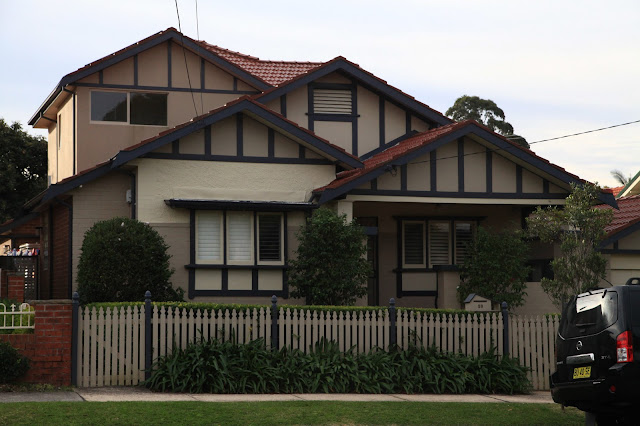
Here are two California Bungalows each of which has been extended in its own unique way.
The first one, while keeping the shape with a double-pike, appears soul-less. Something renovated to appear in House & Garden, rather than renovated for a family to live in. Perhaps they purchased based upon location rather than in admiration of the style.
The second house, has kept all the trim, plus the windows that are essential to the style, but then have tacked on a second floor, with windows that are an abomination to the style. |


8 comments:
Both look as if they have indulged in a necessity for inside needs but little attention given to the outside presentation! The first example looks quite lopsided! (Perhaps I should say asymmetrical!)
The second looks slightly better than the first to me.
Oh dear, yes, those windows. But at least they didn’t replace the original downstairs ones to match. Don’t laugh, Julie – I’ve seen it done.
We have a variety in my suburb too. :)
Hmmm. Surely it would have been possible to enhance rather than detract from the original style.
I think it shows a general lack of respect for the original style.
As I understand it a bungalow is a single storey dwelling so the minute they went upwards they broke away from them being a Californian bungalow.
Even though they have tried, both fail to respect the style. Perhaps they should have kept their reno to out the back.
I have just been to Melbourne where my friend has a CB built in 1925, which was 2 storey from the beginning.
Post a Comment